Overview: This discusses creating a Bullet Graph in SQL Server Reporting Services (SSRS). The following screen shots are from SQL Server 2012.
The Bullet Graph
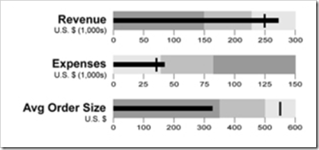
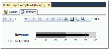
Bullet graphs were developed by Stephen Few as a “no-frills” design alternative to traditional gauges which can be overly “showy,” take up a lot of space, and be difficult to interpret. I like bullet graphs because they show a lot of information for a measurement or a KPI in a very small space. The following example shows actual, target and thresholds in a very compact style:
Let’s break it down:
- The black bar is typically the Actual measurement. This is considered the featured measure.
- The tick mark is typically the Target to which we are comparing the Actual. This is considered the comparative measure.
- The background colors are typically thresholds that indicate if the Actual is acceptable. The thing about the thresholds is that they give a lot of extra contextual information. Two to five qualitative ranges is most common.
- The scale shown below the axis defines the actual value, target value, and threshold ranges.
- The label on the left indicates which measurement or KPI is being displayed.
Bullet graphs can be horizontal or vertical. You can include colors for the threshold backgrounds if you prefer – however, the design specification for the Bullet Graph specifies using different intensities of black.
Also, note on the 1st screen shot above that the background color for the thresholds is inverted for the Revenue and Expenses – i.e., more Revenue is better & less Expenses is better so the light background color is always better than the dark background color. However you decide to handle it, try to be consistent from report to report. A bullet graph requires just a bit of initial end-user training, so keeping things consistent is always a very good idea to minimize training required.
Creating a Bullet Chart in SSRS
Here’s the steps for reproducing the Revenue bullet graph:
1. Create Source Data. This step is for us to create a bit of source data to work with in this example. Keep in mind there’s many different ways you could structure this – what’s shown here is a relatively realistic (yet simplistic) representation of how the data might be stored in a data warehouse using a star schema model.
SET ANSI_NULLS ON
GO
SET QUOTED_IDENTIFIER ON
GO
SET ANSI_PADDING ON
GO
CREATE TABLE [dbo].[Dim_KPI_Measurements](
[Measurement_id] [int] IDENTITY(1,1) NOT NULL,
[MeasurementGroup] [varchar](30) NOT NULL,
[MeasurementType] [varchar](30) NOT NULL,
[MeasurementName] [varchar](30) NOT NULL,
[MeasurementSort] [tinyint] NOT NULL
) ON [PRIMARY]GO
SET ANSI_PADDING OFF
GOSET ANSI_NULLS ON
GO
SET QUOTED_IDENTIFIER ON
GO
CREATE TABLE [dbo].[Fact_KPI_Measurements](
[Measurement_id] [int] NOT NULL,
[MeasurementAmount] [decimal](18, 2) NULL,
[RangeFromValue] [decimal](18, 2) NULL,
[RangeToValue] [decimal](18, 2) NULL
) ON [PRIMARY]GO
SET IDENTITY_INSERT [dbo].[Dim_KPI_Measurements] ONGO
INSERT [dbo].[Dim_KPI_Measurements] ([Measurement_id], [MeasurementGroup], [MeasurementType], [MeasurementName], [MeasurementSort]) VALUES (1, N'Revenue', N'Actual', N'Revenue Actual', 0)
GO
INSERT [dbo].[Dim_KPI_Measurements] ([Measurement_id], [MeasurementGroup], [MeasurementType], [MeasurementName], [MeasurementSort]) VALUES (2, N'Revenue', N'Target', N'Revenue Target', 0)
GO
INSERT [dbo].[Dim_KPI_Measurements] ([Measurement_id], [MeasurementGroup], [MeasurementType], [MeasurementName], [MeasurementSort]) VALUES (3, N'Revenue', N'Range', N'Revenue Poor Range', 1)
GO
INSERT [dbo].[Dim_KPI_Measurements] ([Measurement_id], [MeasurementGroup], [MeasurementType], [MeasurementName], [MeasurementSort]) VALUES (4, N'Revenue', N'Range', N'Revenue Middle Range', 2)
GO
INSERT [dbo].[Dim_KPI_Measurements] ([Measurement_id], [MeasurementGroup], [MeasurementType], [MeasurementName], [MeasurementSort]) VALUES (5, N'Revenue', N'Range', N'Revenue Satisfactory Range', 3)
GO
INSERT [dbo].[Dim_KPI_Measurements] ([Measurement_id], [MeasurementGroup], [MeasurementType], [MeasurementName], [MeasurementSort]) VALUES (6, N'Expense', N'Actual', N'Expense Actual', 0)
GO
INSERT [dbo].[Dim_KPI_Measurements] ([Measurement_id], [MeasurementGroup], [MeasurementType], [MeasurementName], [MeasurementSort]) VALUES (7, N'Expense', N'Target', N'Expense Target', 0)
GO
INSERT [dbo].[Dim_KPI_Measurements] ([Measurement_id], [MeasurementGroup], [MeasurementType], [MeasurementName], [MeasurementSort]) VALUES (8, N'Expense', N'Range', N'Expense Poor Range', 1)
GO
INSERT [dbo].[Dim_KPI_Measurements] ([Measurement_id], [MeasurementGroup], [MeasurementType], [MeasurementName], [MeasurementSort]) VALUES (9, N'Expense', N'Range', N'Expense Middle Range', 2)
GO
INSERT [dbo].[Dim_KPI_Measurements] ([Measurement_id], [MeasurementGroup], [MeasurementType], [MeasurementName], [MeasurementSort]) VALUES (10, N'Expense', N'Range', N'Expense Satisfactory Range', 3)
GO
SET IDENTITY_INSERT [dbo].[Dim_KPI_Measurements] OFF
GO
INSERT [dbo].[Fact_KPI_Measurements] ([Measurement_id], [MeasurementAmount], [RangeFromValue], [RangeToValue]) VALUES (1, CAST(265000.00 AS Decimal(18, 2)), NULL, NULL)
GO
INSERT [dbo].[Fact_KPI_Measurements] ([Measurement_id], [MeasurementAmount], [RangeFromValue], [RangeToValue]) VALUES (2, CAST(250000.00 AS Decimal(18, 2)), NULL, NULL)
GO
INSERT [dbo].[Fact_KPI_Measurements] ([Measurement_id], [MeasurementAmount], [RangeFromValue], [RangeToValue]) VALUES (3, NULL, CAST(0.00 AS Decimal(18, 2)), CAST(150000.00 AS Decimal(18, 2)))
GO
INSERT [dbo].[Fact_KPI_Measurements] ([Measurement_id], [MeasurementAmount], [RangeFromValue], [RangeToValue]) VALUES (4, NULL, CAST(150000.01 AS Decimal(18, 2)), CAST(225000.00 AS Decimal(18, 2)))
GO
INSERT [dbo].[Fact_KPI_Measurements] ([Measurement_id], [MeasurementAmount], [RangeFromValue], [RangeToValue]) VALUES (5, NULL, CAST(225000.01 AS Decimal(18, 2)), CAST(300000.00 AS Decimal(18, 2)))
GO
INSERT [dbo].[Fact_KPI_Measurements] ([Measurement_id], [MeasurementAmount], [RangeFromValue], [RangeToValue]) VALUES (6, CAST(40000.00 AS Decimal(18, 2)), NULL, NULL)
GO
INSERT [dbo].[Fact_KPI_Measurements] ([Measurement_id], [MeasurementAmount], [RangeFromValue], [RangeToValue]) VALUES (7, CAST(30000.00 AS Decimal(18, 2)), NULL, NULL)
GO
INSERT [dbo].[Fact_KPI_Measurements] ([Measurement_id], [MeasurementAmount], [RangeFromValue], [RangeToValue]) VALUES (8, NULL, CAST(0.00 AS Decimal(18, 2)), CAST(35000.00 AS Decimal(18, 2)))
GO
INSERT [dbo].[Fact_KPI_Measurements] ([Measurement_id], [MeasurementAmount], [RangeFromValue], [RangeToValue]) VALUES (9, NULL, CAST(35000.01 AS Decimal(18, 2)), CAST(80000.00 AS Decimal(18, 2)))
GO
INSERT [dbo].[Fact_KPI_Measurements] ([Measurement_id], [MeasurementAmount], [RangeFromValue], [RangeToValue]) VALUES (10, NULL, CAST(80000.01 AS Decimal(18, 2)), CAST(150000.00 AS Decimal(18, 2)))
GO
2. Data Source. Add a shared source to the project which connects to the database where you created the tables in Step 1. Also create a data source within your new report.
3. Dataset. Add the following dataset to the report. Keep in mind there’s lots of ways to do this – my approach here was to use a CTE to pivot the data from rows to columns, then aggregate it into one summarized row for the bullet graph to present. The variable at the top is to make the query easily reusable for other KPIs.
DECLARE @MeasurementGroup varchar(30)
SET @MeasurementGroup = 'Revenue';WITH CTE_Details
AS
(
SELECT
Dim.MeasurementGroup
,Dim.MeasurementType
,Dim.MeasurementName
,Dim.MeasurementSort
,Actual = CASE WHEN Dim.MeasurementType = 'Actual'
THEN Fact.MeasurementAmount
ELSE NULL
END
,Target = CASE WHEN Dim.MeasurementType = 'Target'
THEN Fact.MeasurementAmount
ELSE NULL
END
,Range1From = CASE WHEN Dim.MeasurementType = 'Range'
AND Dim.MeasurementSort = 1
THEN Fact.RangeFromValue
ELSE NULL
END
,Range1To = CASE WHEN Dim.MeasurementType = 'Range'
AND Dim.MeasurementSort = 1
THEN Fact.RangeToValue
ELSE NULL
END
,Range2From = CASE WHEN Dim.MeasurementType = 'Range'
AND Dim.MeasurementSort = 2
THEN Fact.RangeFromValue
ELSE NULL
END
,Range2To = CASE WHEN Dim.MeasurementType = 'Range'
AND Dim.MeasurementSort = 2
THEN Fact.RangeToValue
ELSE NULL
END
,Range3From = CASE WHEN Dim.MeasurementType = 'Range'
AND Dim.MeasurementSort = 3
THEN Fact.RangeFromValue
ELSE NULL
END
,Range3To = CASE WHEN Dim.MeasurementType = 'Range'
AND Dim.MeasurementSort = 3
THEN Fact.RangeToValue
ELSE NULL
ENDFROM dbo.Fact_KPI_Measurements Fact
INNER JOIN dbo.Dim_KPI_Measurements Dim
ON Fact.Measurement_id = Dim.Measurement_idWHERE Dim.MeasurementGroup = @MeasurementGroup
)
SELECT
Actual = SUM(Actual)
,Target = SUM(Target)
,Range1From = SUM(Range1From)
,Range1To = SUM(Range1To)
,Range2From = SUM(Range2From)
,Range2To = SUM(Range2To)
,Range3From = SUM(Range3From)
,Range3To = SUM(Range3To)FROM CTE_Details
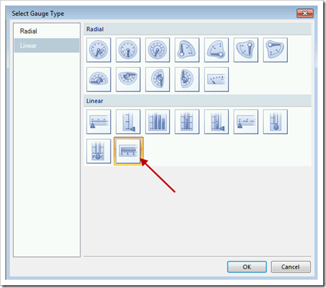
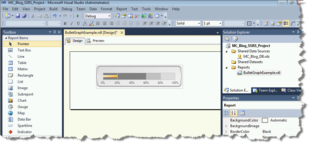
4. Gauge. Drag a Gauge from the Toolbox to the Body of the report. Select the Bullet Graph, which is the last item in the Linear section.
The starting point within SSRS before any properties are defined includes two pointers (LinearPointer1 and 2) and three thresholds (LinearRange1, 2, and 3). That’s good because that’s exactly the number of objects we need to create our Revenue bullet chart.
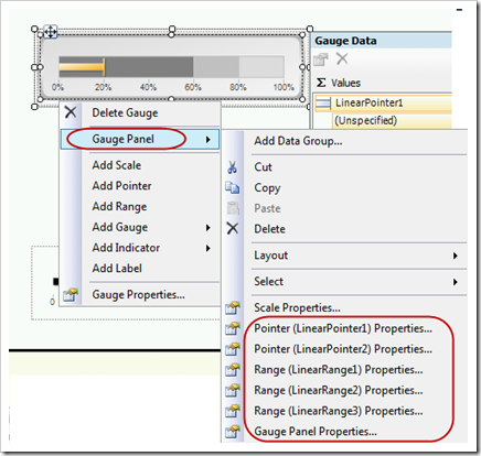
For the next several steps we are going to be using various properties. If you right-click the object and navigate the Gauge Panel menu, you will find various properties available for each Pointer, Range, and the Gauge Panel itself.
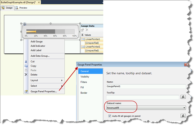
5. Gauge Panel Properties. From the Gauge Panel Properties, select the dataset created in step 3 to associate the bullet graph to the dataset query.
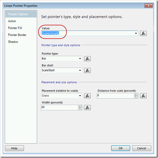
6. Actual (LinearPointer1) Properties.
Pointer Options page: Select the Value to be the Actual field. It will automatically aggregate it as a sum, which is fine.
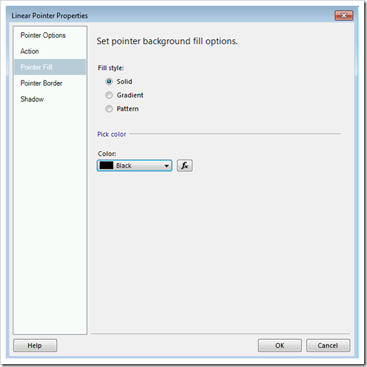
Pointer Fill page: Set the Fill Style to Solid, and the Color as Black.
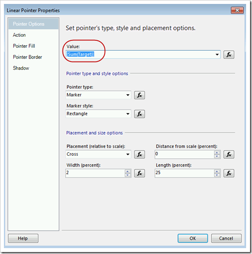
7. Target (LinearPointer2) Properties.
Pointer Options page: Select the Value to be the Target field.
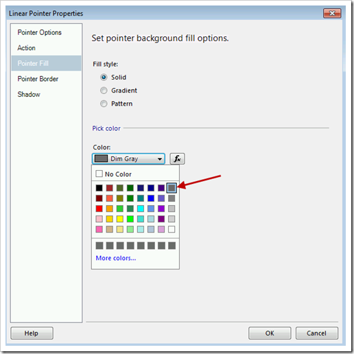
Pointer Fill page: Set the Fill Style as Solid, and the Color as Dim Gray. The specification calls for 75% black here, and Dim Gray is close to that.
8. Poor Range (LinearRange1) Properties.
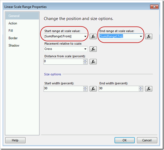
General page: Set the Start Range to the the “Range1From” field, and the End Range to be the “Range1To” field.
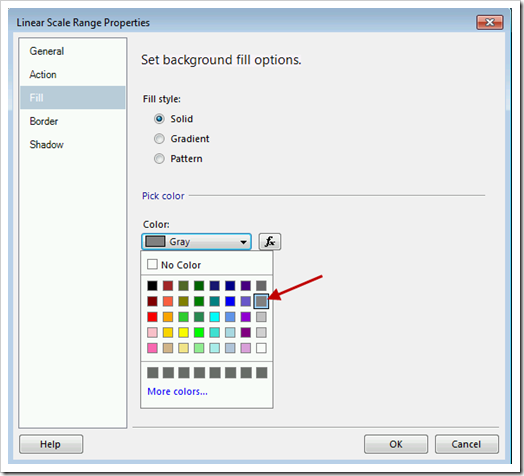
Fill page: Set the Fill Style to be Solid, and the Color to be Gray. The specification for 3 states calls for 40% black here, so Gray is close.
Note that by using fields instead of hard-coded ranges you no longer see the range while in Design mode. You can still access its properties through.
9. Middle Range (LinearRange2) Properties.
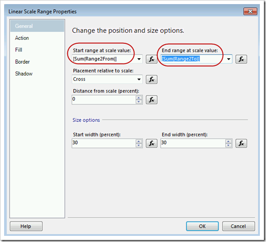
General page: Set the Start Range to the the “Range2From” field, and the End Range to be the “Range2To” field.
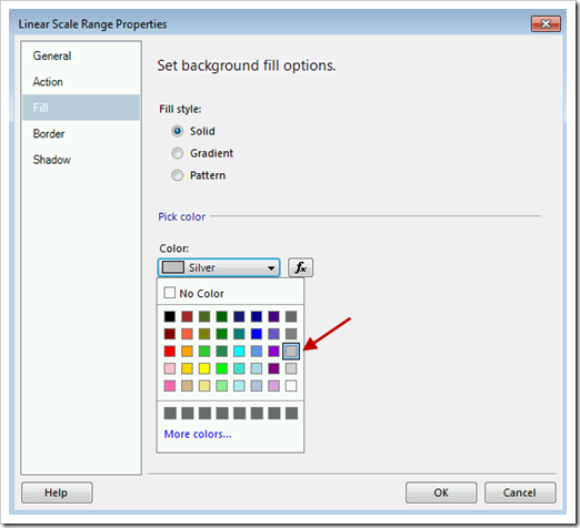
Fill page: Set the Fill Style to be Solid, and the Color to be Silver. The specification for 3 states calls for 25% black here, so Silver is close.
10. Satisfactory Range (LinearRange3) Properties.
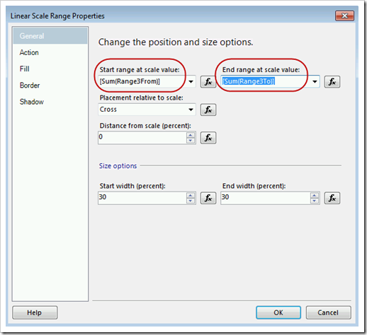
General page: Set the Start Range to the the “Range3From” field, and the End Range to be the “Range3To” field.
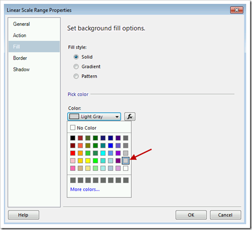
Fill page: Set the Fill Style to be Solid, and the Color to be Light Gray. The specification for 3 states calls for 10% black here, and Light Gray is close to that.
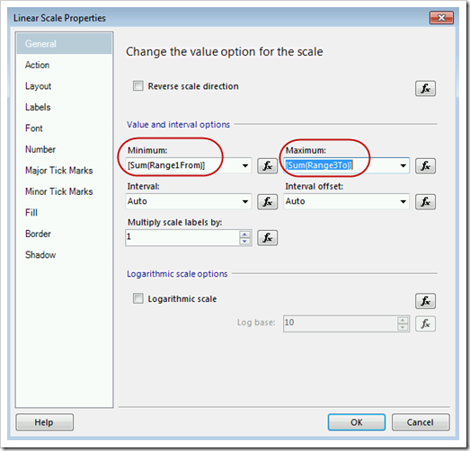
11. Scale (LinearScale1) Properties. Right-click the Scale and choose Scale Properties.
General Page: Set the Minimum to be the “Range1From” field, and the Maximum to be the “Range3To” field.
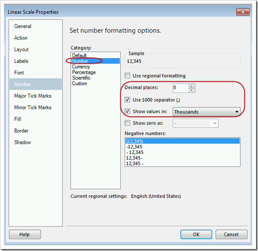
Number page: Set the Category to be Number. Decimal places should be 0. Use 1000 separator. Show values in Thousands.
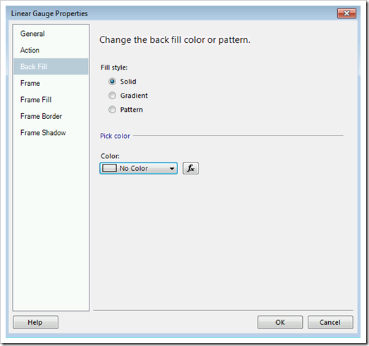
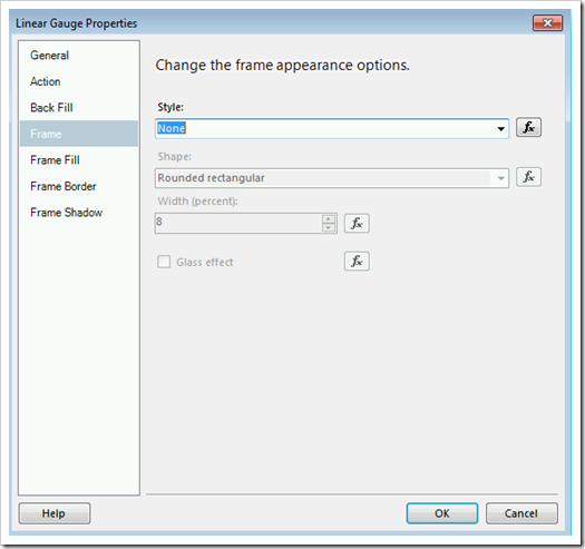
12. Gauge Properties. Right-click the object and choose Gauge Properties.
Back Fill page: Set the Fill Style to be Solid, and No Color.
Frame page: Set the Style to be None.
13. Label. From the Toolbox, drag a Text Box onto the Body. Call it Revenue, with a bold 10pt font. Drag a second Text Box onto the Body. Place it just below the Revenue one. Call it “U.S. $ (1,000s)”, with a 9pt font. Right-justify both text boxes.
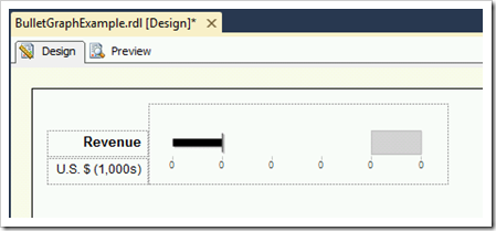
The finished SSRS gauge object should look like this:
At this point you can continue tweaking the properties (there sure are a lot of them to play with!) & build out the remainder of the report or dashboard page.
Finding More Information
Stephen Few – Bullet Graph Design Specification

